

The best golf club logos do not necessarily feature a golfer, a golf ball, or a flagstick. In fact, according to George Peper, some of the most effective designs have little to do with golf at all.
Peper, who spent a quarter of a decade as the editor-in-chief of Golf Magazine and has recently coauthored a book looking at the best logos in golf, believes the key to a successful one is its meaning.
“I think the very best logos don’t suggest golf at all,” he said when speaking on the NCG Top 100s podcast.
His book, The Best Logos in Golf, takes a look at a range of logos that have helped shape the game. He estimates fewer than 10 of those feature something that remotely symbolises golf.
The most memorable designs often draw on a club’s history, its surroundings or an unexpected detail that gives members and visitors something to talk about.
He added: “The most important criteria for me in doing the book was what I would call the backstory – the story behind the logo or the club, because I had to do the job of writing 500 words about each of 100 logos and a lot of them are graphically great and distinctive.
“I did the ones that had a symbolism where you have to look at them for a while to find the initials of the club, or learn something about the club, but it was the stories.
“Incredibly, if one thing surprised me about doing the book, I would say a quarter to a third of them didn’t have stories. The people responsible for the club or the logo, they didn’t know anything about them.”
Golf has its fair share of unusual logo designs
One of Peper’s favourite examples is the logo of Merion in Pennsylvania, which features a wicker basket mounted on a flagstick with a Scottish broom in the background.
Advertisement
MacArthur Golf Club also uses a distinct design feature to help create greater interest in the emblem. A logo that works is one that prompts curiosity amongst people in wanting to find out what is.
“Ironically, one of the most reclusive or a club that wants to remain under the radar is MacArthur,” Peper said. “[It’s] A relatively new course down in Florida and it’s on a dairy farm, therefore the logo is a simple – old glass milk bottle, nothing more.
“I think it’s pretty ironic that they want to remain anonymous, and yet they have this logo that begs questions, so that anybody who wears a shirt with a milk bottle on gets asked ten times a day what’s that about.
“I’m not going to make any friends on your side of the pond, but most of your (British) logos are pretty bad. They haven’t been modernised. There’s some still back in the Middle Ages.”
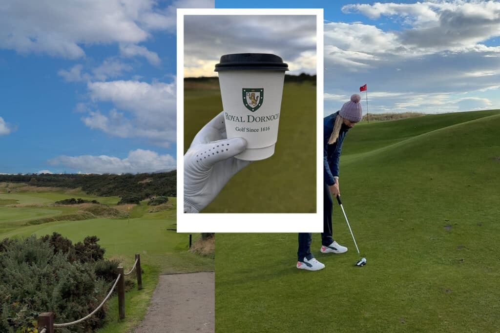
Despite his criticisms, Peper did single out Royal Dornoch’s for praise. And, in particular, its rather unusual emblem.
“I think my favourite among British logos is Royal Dornoch; the wildcat,” he explained. “I had no idea that there were cats like that wandering around the Scottish Highlands, and lo and behold there are.
“It’s a fairly angry-looking beast. It’s standing up and snarling, and its claws are out. You don’t see that very often on golf club logos.”
LISTEN TO OUR PODCAST
NOW HAVE YOUR SAY
What is your favourite golf club logo? Do you buy club merchandise – polos, hats, jumpers – from courses you play at? If not, why not? Let us know in the comments or by getting in touch with us on X!