It’s the sport where we’re usually individuals – and that goes right down to what we choose to wear on the golf course.
Whether it’s an exclusive line for the headliners or a trademark accessory a player is not seen without, we can see some wild outfits each week on the tours.
But there’s a beauty about team events – the chance to bond by dressing uniformly, putting sponsorships and fashion preferences aside.
Now we say there is a beauty to this, but it’s so often lost when a woeful design is unveiled that does no one any sartorial favours.
But is that jumper really a fashion gem, or a massive faux pas?
So let’s get our teeth stuck into some of the worst US Presidents Cup outfits and a few stunners from the Internationals too.
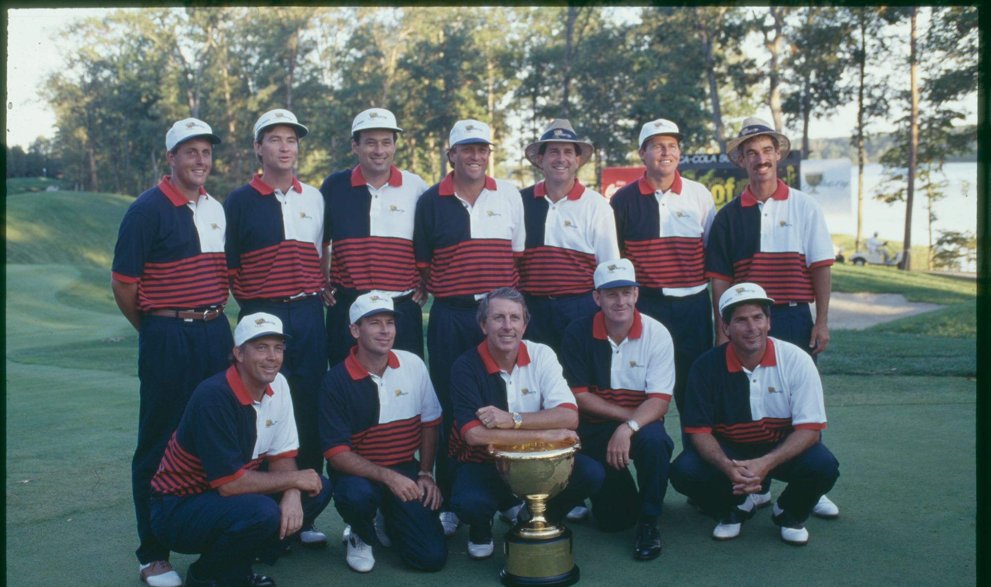
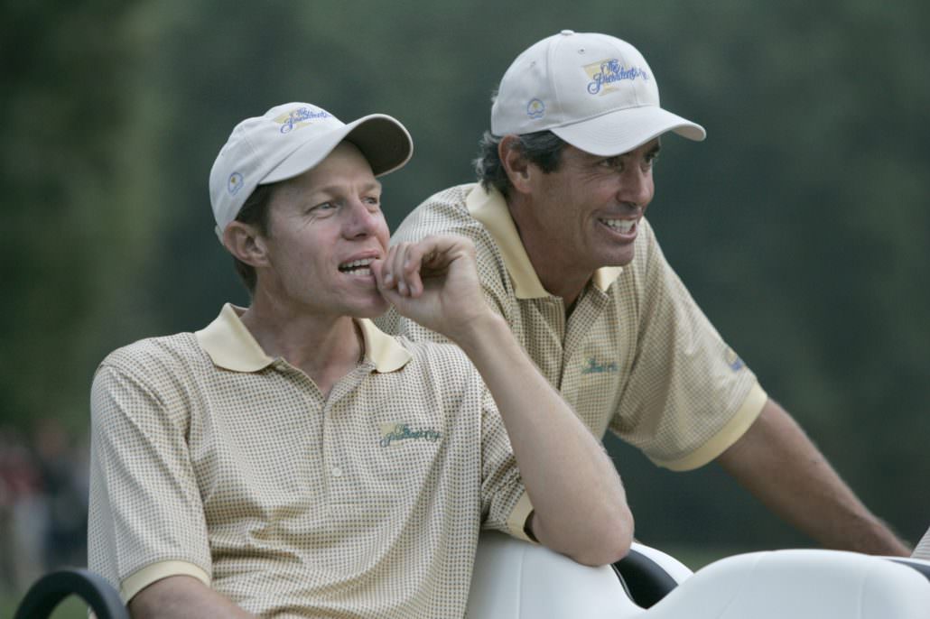
9. US Presidents Cup outfits – 1994
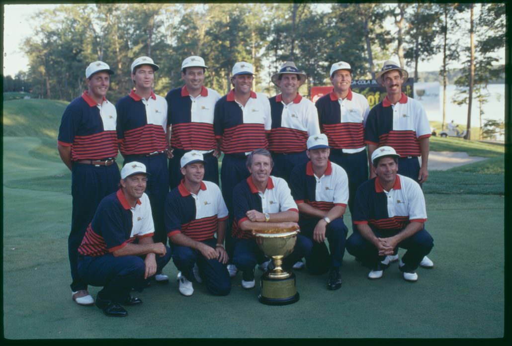
Not the flashiest outfit to begin with, but there’s a little too much going on with those polos. Elmer the Elephant would be proud of patches like those on the upper half and sleeves.
8. USA – 1996
Ah, the classic kitchen tea towel. Freddie Couple fronts this particular photo and it seems criminal that such a cool guy was kitted out in this specimen.
7. 1996 – Internationals
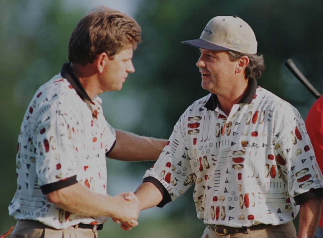
There’s really not much you can say about this. ‘Why?’ is the question that prevails in my head.
Who thought it was a good idea to feature a golf bag and its contents on a polo? I may have just been born when this shirt was worn, but surely fashion wasn’t that bad back then, was it?
6. Internationals – 2005
A shower curtain? Your Granny’s old wallpaper? I can’t decide where they got the inspiration for this one from but I’d love to find out.
5. USA – 2009
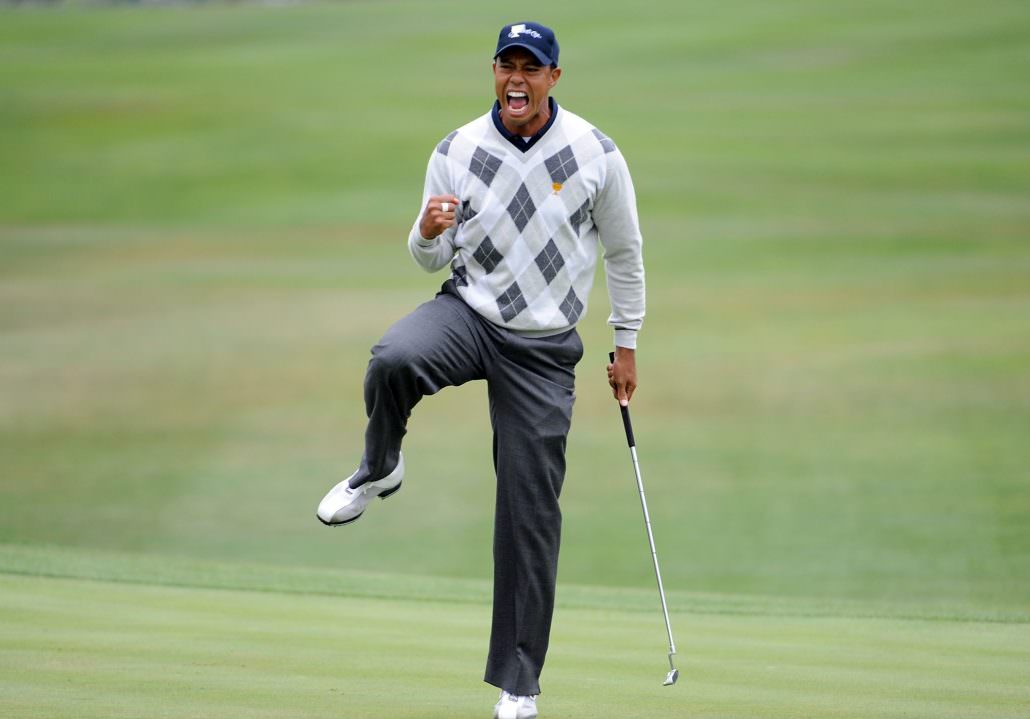
I know, I know, this isn’t that bad. But that jumper just makes me wince. When I think of the 2011 Presidents Cup, I think of THAT Tiger Woods shot.
Advertisement
I’ve watched it a hundred times and, each time, I find myself thinking, ‘man, I wish he had a sharp outfit.’
Such a great shot, such a poor jumper.
4. USA – 2011
This is one of the most simplistic designs we’ve seen and yet, so, so frustrating.
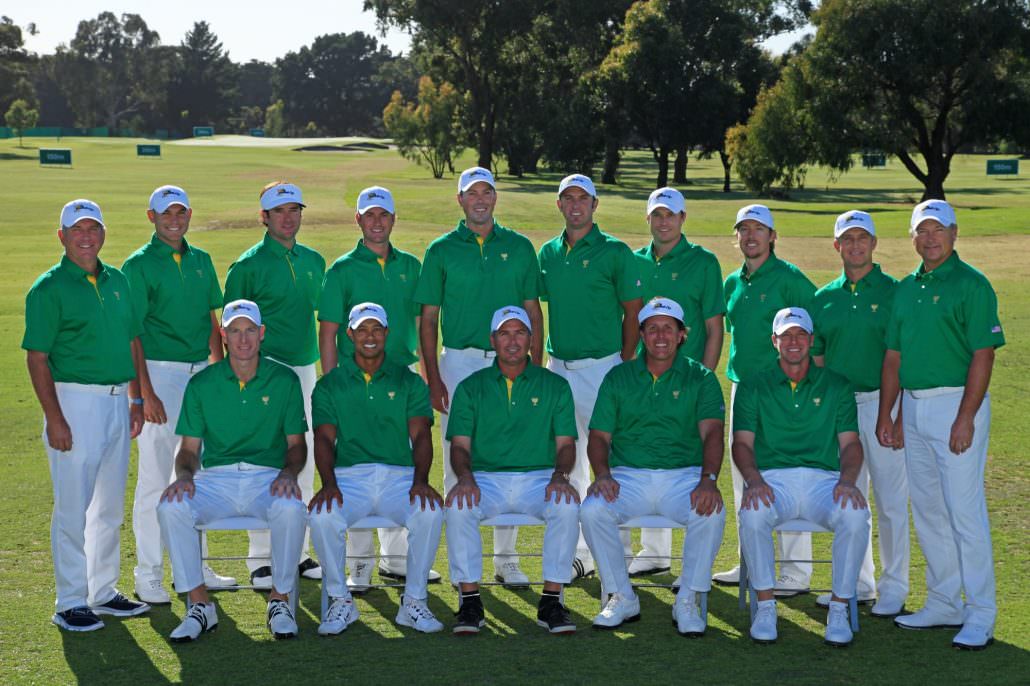
The 2011 event was held in Australia and, for some reason, USA decided they would wear the national colours of the host nation. Baffling.
I would be fully disapproving of the European Ryder Cup team if they turned up at Whistling Straits in Stars and Stripes.
3. Internationals – 2011
Colourful barcodes, brilliant.
2. Internationals – 2013
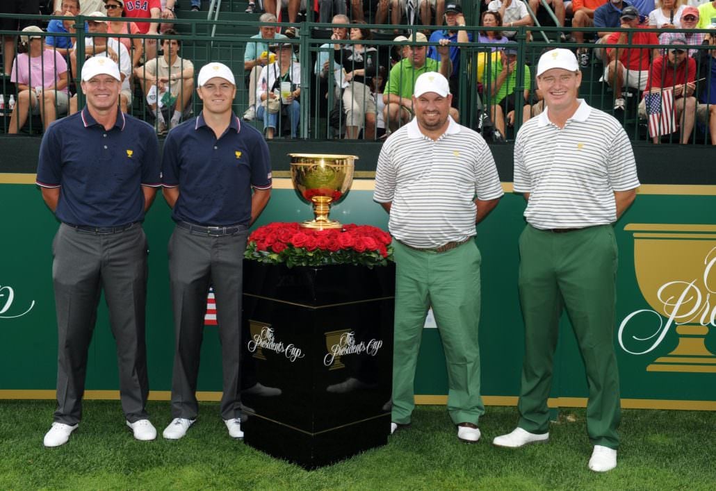
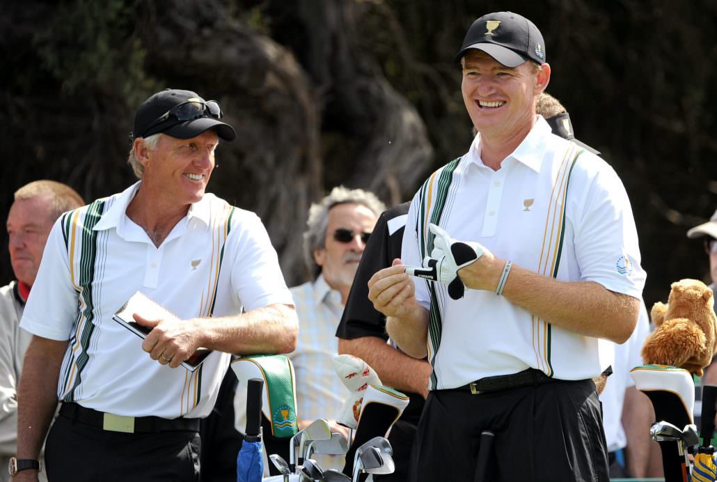
Let’s just observe these two polar opposites.
Then let’s discuss why Ernie Els and Brendan de Jonge’s trousers are strikingly different shades of green. Annoying, I know.
I don’t really rate green trousers as it is, but hey, at least they aren’t white.
1. Internationals – 2015
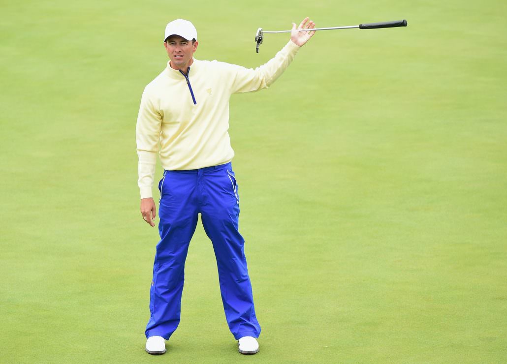
Where to being with this one?
From the bottom to the top it is pretty dreadful. The electric blue trousers are garish and that zip top is a sickening shade of yellow.
If they are the two colours you’re going for then go all in and plunge for the blue cap too. The white is unsettlingly obscure. I’m glad this one’s behind us…
Advertisement